1. At Coterie fashion trade show: This print san-serif font is large and effective in communicating information in a very large convention space. Still, it maintains sophistication and channels the dynamic, trendy vibe of the event.
.jpg)

2. Milly - a participating brand at Coterie. The type face is very curly and feminine, appropriate for a high-end brand that retails at department stores like Saks and Neiman Marcus.

3. Max and Cleo: has an interesting choice of type - it's quite minimalist. The simplicity also contrasts with the image, which has soft movements. I think it reflects the brand's clothing, which are mid-end, practical dresses for women.

4. The Bread Factory: The font conveys something quite fun and energetic. It is easy to read and stands out because it is framed by the circles. It looks like a stamp of quality. It kind of reminds me of the Coffee Bean logo.

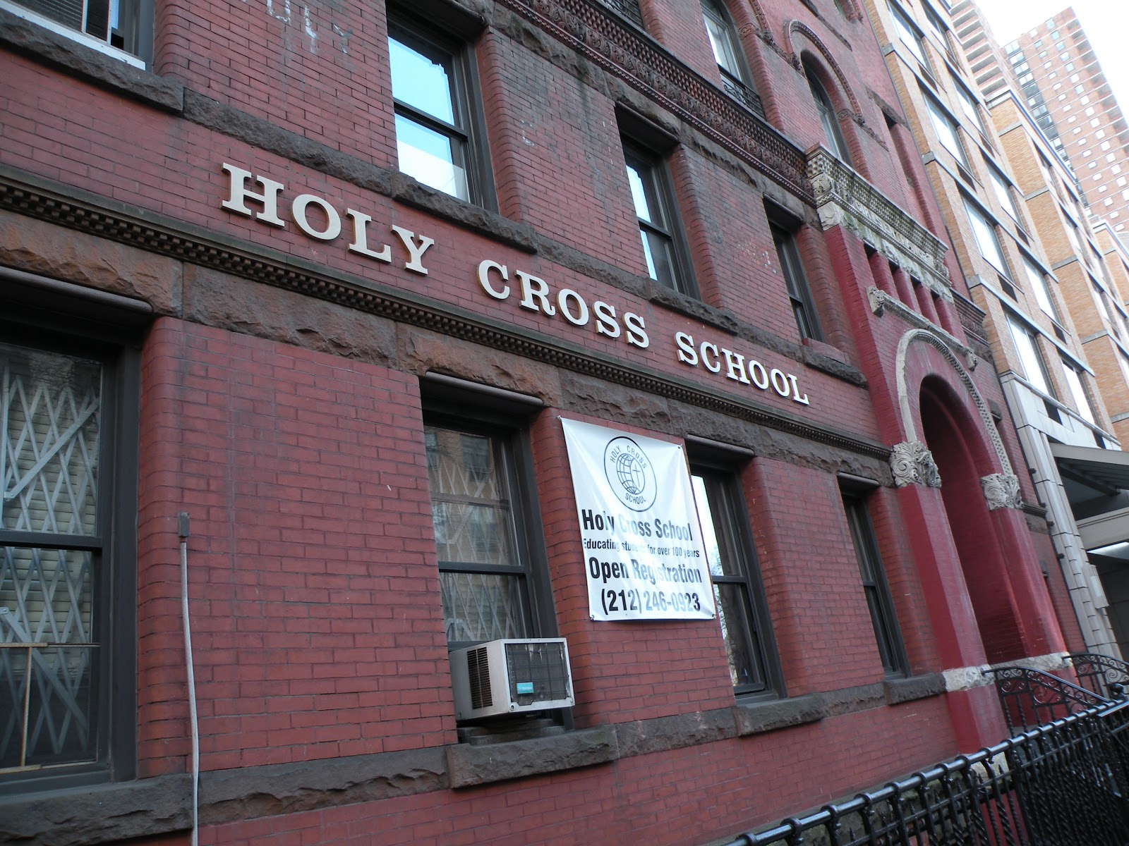
5. The Holy Cross School: The font is very prominent. This serif font is neither too complicated (hard to read) or unsophisticated (too commercial, plain).
Ineffective:
1. Banner for the new Bud Light Platinum. The new design of a slim, blue bottle closely resembles that of a Skyy vodka bottle. The metal effect of the letters helps to make it pop. The type is also large enough to catch attention. However, the type seems too generic (all caps) to convey the exclusive/high end image of the product.

2. "Enter" sign: The type is very bold. But the shortness of the letters and the way they're stacked vertically make them very hard to read. The same problem applies to the Samaritan Village Veteran Program sign below.

3. Samaritan:

4. Schnippers: The all-caps type is hard to read. The letters stand alone without a solid background to make them pop. Maybe it works better at night. Also, it's circus-y, doesn't really make me think of a restaurant.

5. Spider-man Turn off the dark: The font looks like something that is written in chalk on blackboard. It is a creative type but doesn't really work for the concept of the show.

No comments:
Post a Comment